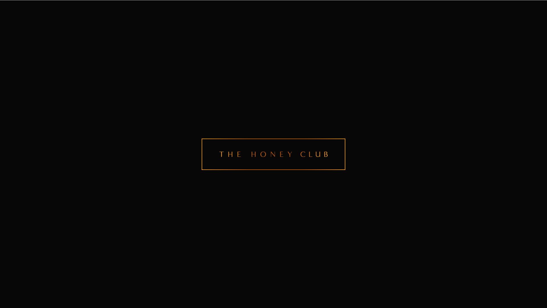
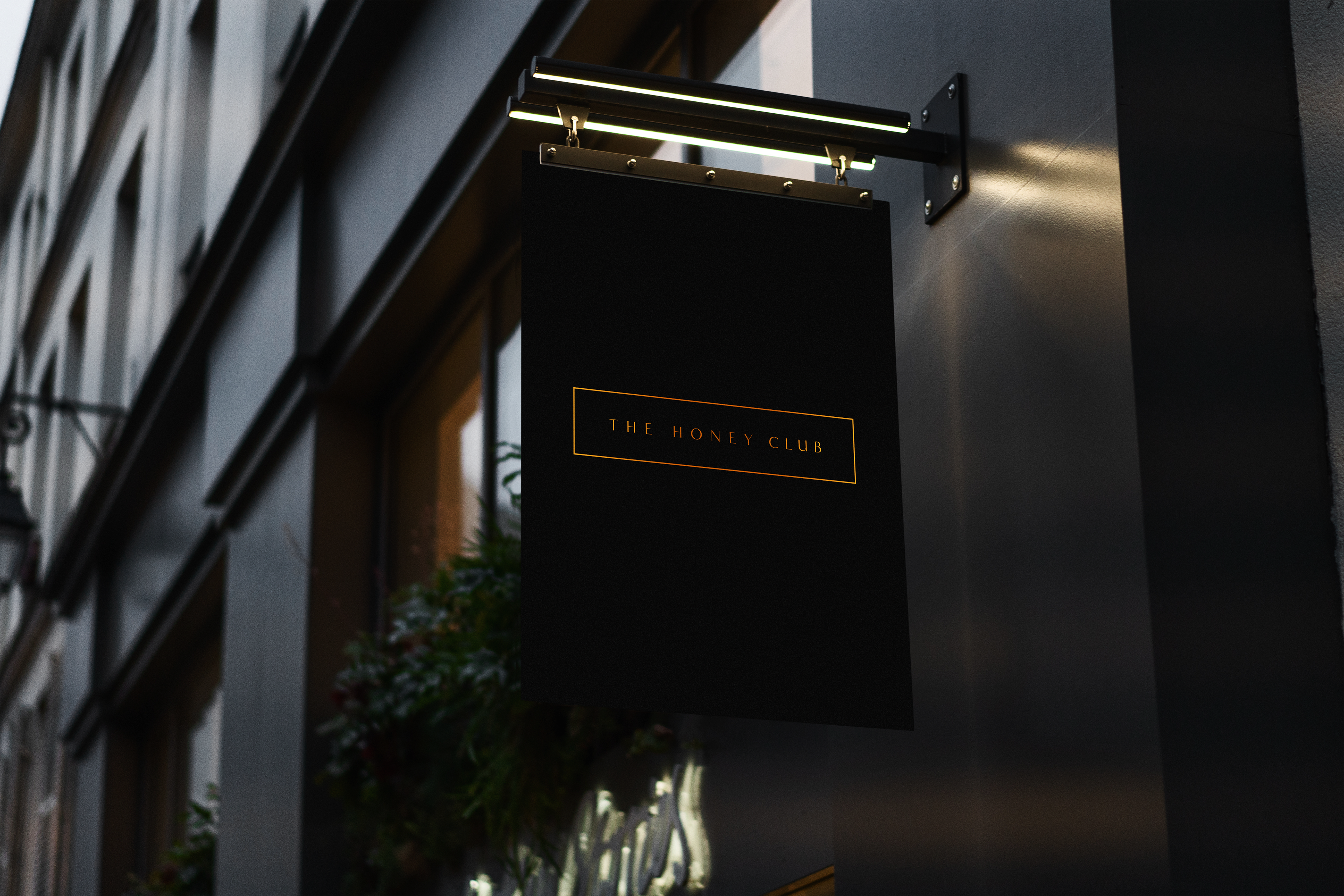
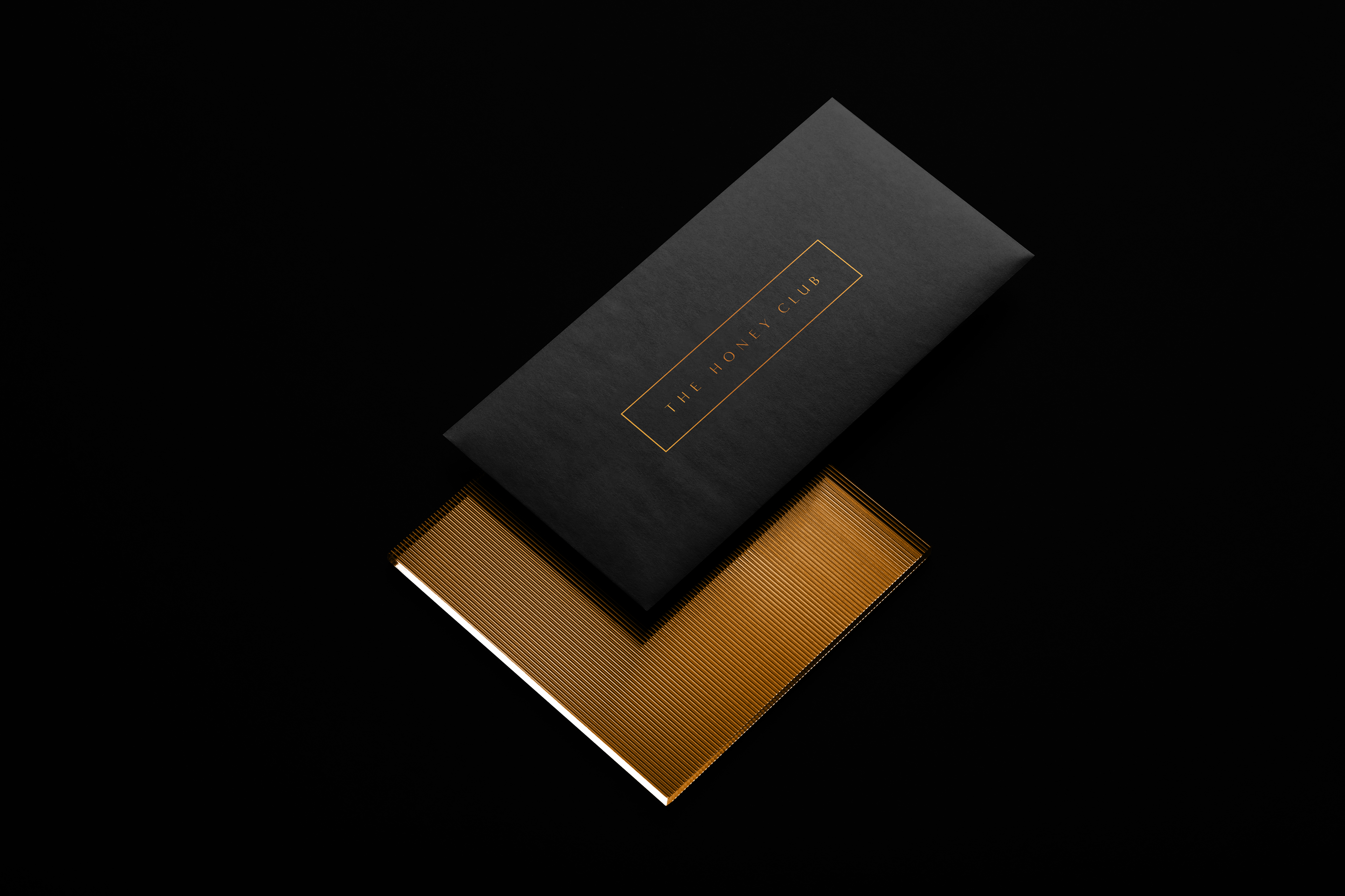
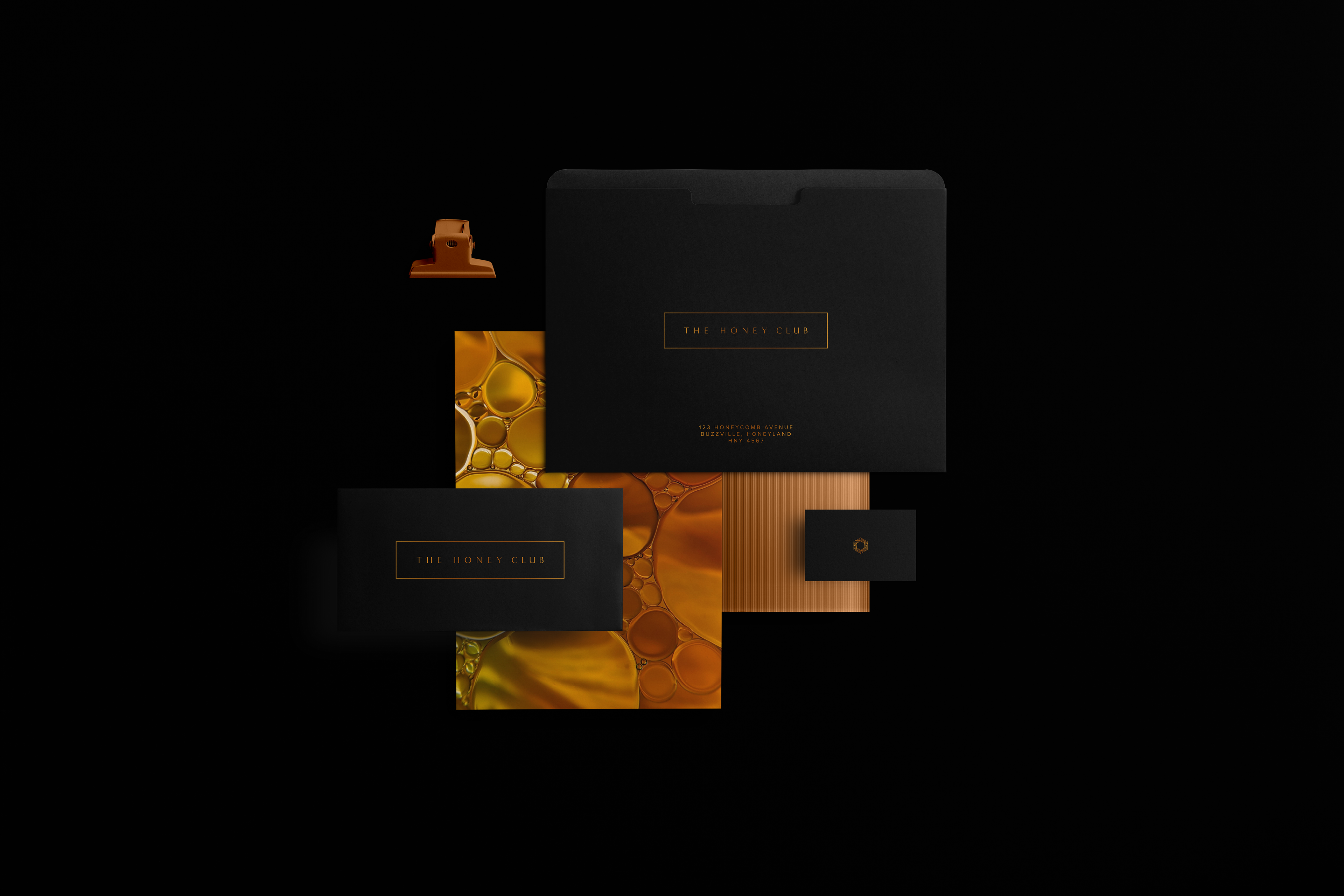
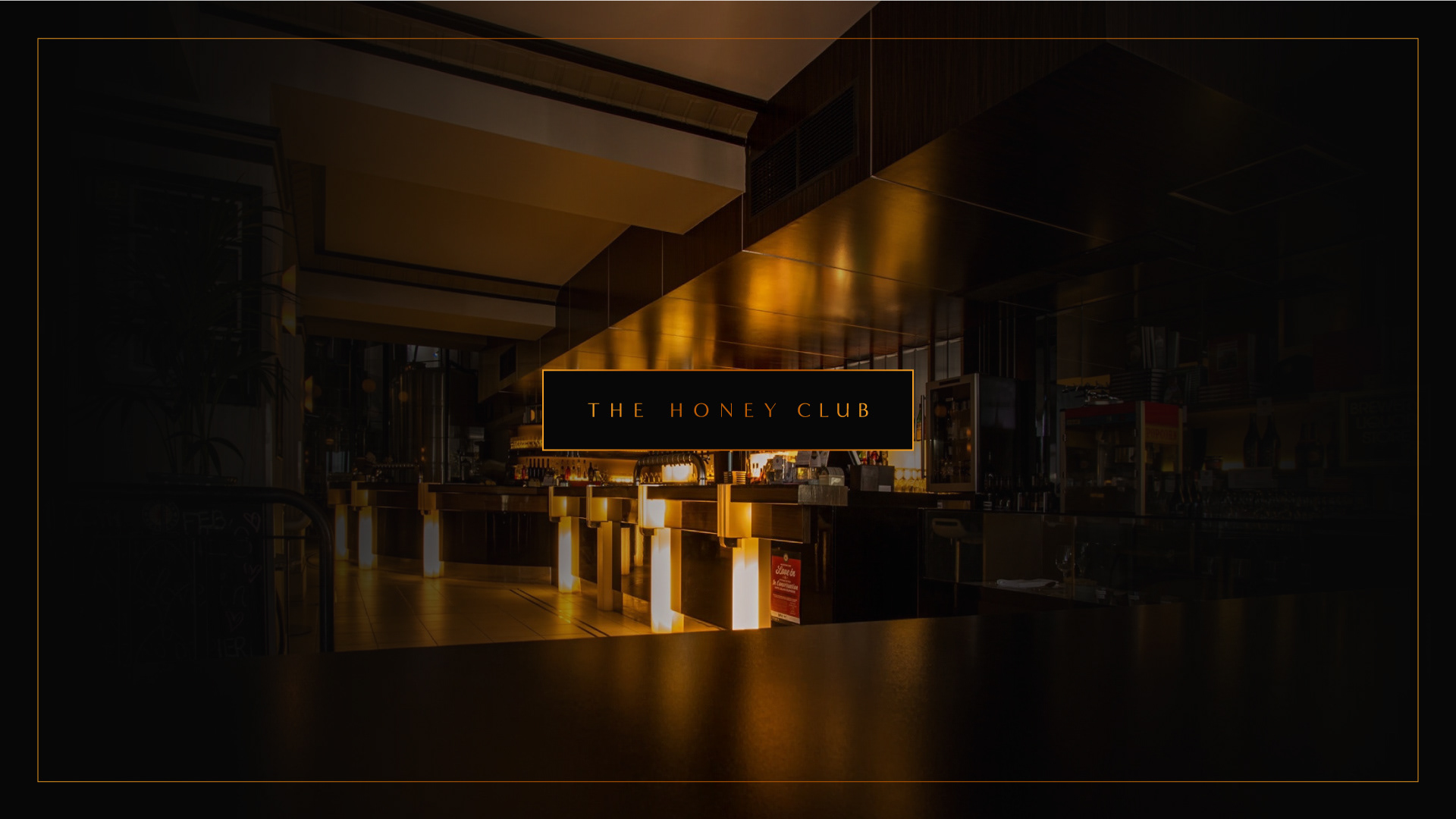
As the creative visionary behind The Honey Club, I had the privilege of conceptualizing and bringing to life the logo design, comprehensive branding elements, captivating stationery, and alluring marketing materials that embody the essence of this esteemed establishment. A premier high-class bar and lounge that encapsulates the essence of refined taste and exclusivity.
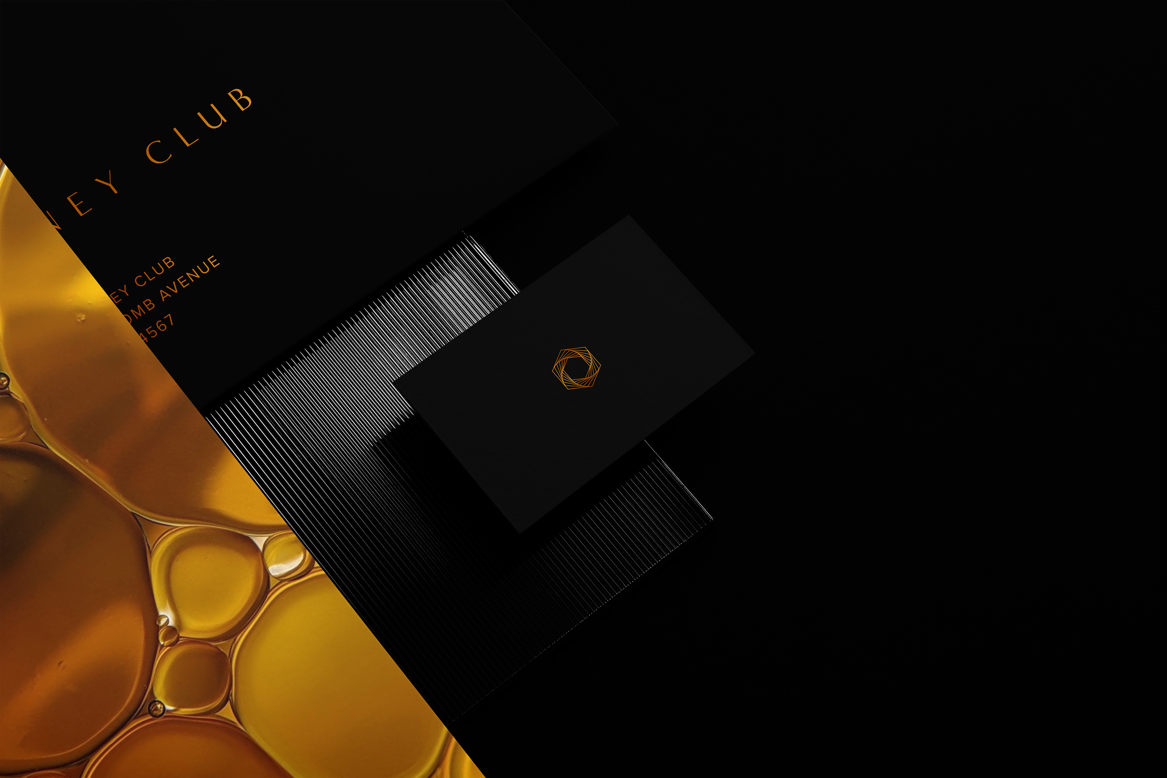
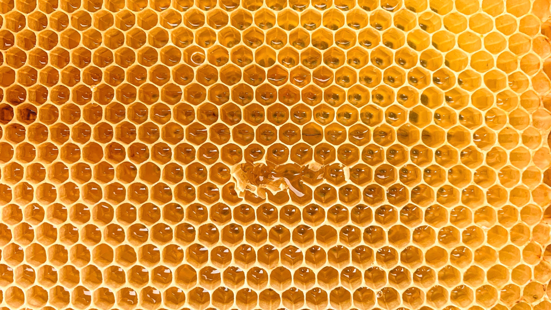
The inspiration behind The Honey Club's golden hexagon logo originates from the mesmerizing beauty and intricate design of honeycombs. Just as honeycombs symbolize nature's meticulous craftsmanship, the hexagonal shape represents the perfect balance of elegance and efficiency. The logo's golden hue not only pays homage to the golden hue of honey but also signifies luxury and exclusivity. With its geometric precision and organic origins, the logo captures the essence of The Honey Club, where nature's wonders blend seamlessly with refined indulgence.